University Color Palette
Color management is a key component of any successful brand. Therefore, it is essential in communicating the University’s identity. Below is the official color palette that should be used when creating any communication materials, e.g., signs, newsletters, posters, ads, etc. Please use the provided swatches. No other swatch colors should be used.
Official University Color Palette
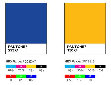
Historically, Northeastern Illinois University’s colors are royal blue and gold.
For publication materials, the official colors are blue (Pantone 293 C) and gold (Pantone 130 C). These colors must be used and remain a dominant design element.
For the University website, please refer to the blue and gold hexadecimal (hex) values in the image below, which are equal to the Pantone colors.
Supportive Color Palette
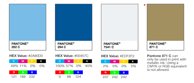
The Supportive Color Palette is provided to aid the design of communications that reflect the University’s brand in tone and style through consistent use of color.
The only acceptable supportive colors are Pantone 292 C, Pantone 294 C, and Pantone 7541 C. Pantone 871 C can only be used in print materials when metallic inks are utilized. Pantone 294 C can only be used for text.
NOTE: Pantone #871 C is metallic ink and can only be used in print materials, when an offset press allows for the use of the Pantone ink system. Using a CMYK or RGB equivalent is not allowed.
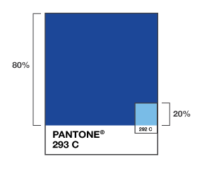
80/20 use of Color Palette
When using the University colors in communication materials, 80 percent of the design must include the Official University Color Palette, and 20 percent may include the Supportive Color Palette. Using the 80/20 rule protects the University’s identity by preventing the Supportive Color Palette from becoming the main focus of color on communication materials.