
Typography is essential to the University’s identity. The following typefaces are authorized for use at Northeastern Illinois University. No other fonts outside of the list below may be used for body copy or in conjunction with the Northeastern logo. Body copy refers to the main text in your communication material.
Primary Typography
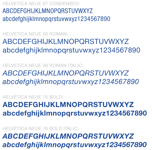
Helvetica Neue (LT) Standard
The Helvetica Neue (LT) Standard font family is the primary sans serif font used at Northeastern.
NOTE: If Helvetica is not available, Arial or Univers may be used as a substitute.
Secondary Typography
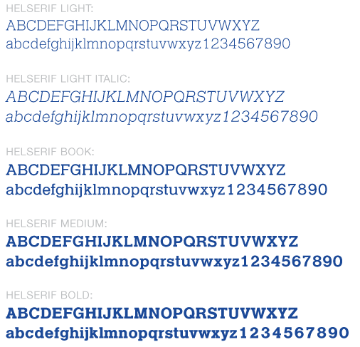
Helserif
This slab serif typeface is an extension of Northeastern’s primary font, Helvetica Neue. It should be used sparingly and only in special circumstances such as headers, subheads or one-line “tags.” When used as a header, subhead or one-line "tag," it is preferred that Helserif is used in letter case only. Under no condition may it be used for body copy.
NOTE: Under no circumstances may another font be substituted for Helserif.
Tertiary Typography
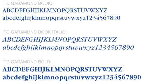
ITC Garamond Family
This serif typeface is for special uses such as letters, books or other publications with an extensive amount of body copy. This font can also be used to add formality to a publication.
NOTE: For correspondence or other formal projects, if Garamond is not available, Georgia may be used as a substitute.
Best Practices
Using Typography in Body Copy
Below are Northeastern’s recommendations for typography use (font size and leading), which represent University approved body copy standards. If used properly, the typography will result in attractive and readable compositions.
Recommendation for Sans Serif: Helvetica Neue (55 Roman) - font size: 8.5, leading: 11
Recommendation for Serif: ITC Garamond (Book) - font size: 9, leading: 12
NOTE: If a page layout program (such as InDesign or Quark) is unavailable or if you are using a word processor, please use the font sizes recommended above and the “default” or “automatic” single line space settings.
Using Sans Serif in Body Copy
Sans serif typefaces are equally as legible as serif typefaces. Sans serif typefaces are common, versatile and easily readable. Since they are common, their letter shapes are immediately recognizable to most readers. Helvetica Neue is Northeastern’s sans serif standard.
Using Justified vs. Flush Left in Body Copy
- DO use flush left, ragged right. It is Northeastern’s official standard.
- DO NOT use justified. While research says it is equally as legible as flush left, it is not part of the University standards. Justified text is only acceptable for formal invitations and a minimal set of University publications.
- DO NOT use flush right, ragged left.
- DO NOT center body copy line for line.
Using Reverse Type
Reverse type (also known as knockout type) is a lighter typeface on a darker background. For example, when using white type on a black background, the background prints and the text is knocked out so that it does not print, allowing the white background (or paper color) to show through. With color on color, both colors print but the background color is knocked out (not printed) in the area occupied by the light-colored type.
Tips for Using Reverse Type
- Use reverse type to separate, stylize or emphasize information.
- Use Helvetica Neue or Arial; this is especially useful if setting reverse type at relatively small sizes. San serif typefaces have thicker strokes than serif typefaces, which can disappear or bleed into the background.
- Use a slightly larger font size for reverse type. This increases the legibility of the type when reversed.
- Ensure that there is adequate color contrast between the text and the background. For example, white on light blue is much harder to read than white on dark blue. The background should always be the equivalent to 50 percent black or darker.
- NEVER use reverse type on busy photographs.